
Thursday, 20 February 2014

Wednesday, 19 February 2014
Narrative Photography Research - First Ideas
Today I spent my afternoon taking images (using just my mobile phone) as development towards my narrative photography project, whilst at a place I spend a lot of my free time at. I thought this would be a good starting point to gain ideas towards creating my series of narrative images.
When taking the photographs I wanted to narrate the locations meaning to me and to portray a narrative to others that makes them ask questions about my photograph.
After looking at my photographs that I took on my phone this afternoon I think that the images work well in black and white and I think that greyscale would be effective if I were to persue this idea of reflection (for example meaningful locations). I believe these images are better in black and white cause I think that automatically makes it look more like a documentary image which makes us question what is being documented and that gives the photograph a narrative.
I believe that if I was to persue this idea I would use black and white film as I personally prefer prints over digital photographs due to the quality and tones of greyscale that can be produced when creating prints.
I am not certain I would like to develop this idea further and I am going to continue taking images to gain direction to producing my final series of narrative photographs.


Introduction into narrative photography
Narrative photography
Narrative photography is often percieved as a photograph that tells a story but after considering this generalisation, I looked at my own photographs and the photography of others; such as those who inspire me, my concept of narrative photography is a wider.
To me, narrative photography is everywhere and can be used to provide a visual message or statement and it can also be used to visually express something such as feeling or to narrate something such as the news and happenings in the world.
When looking at photographers for inspiration I found a wide range of different narratives in photographs from the likes of jeff wall whom creates a lot of constructed photographs to the likes of Eddie Adams a war documentary photographer.
After researching different photographers and questioning their work, I have realised every photograph can have a narrative but everyone can have their own personal perception of what it is therefore it can be difficult for a photographer to portray their own narrative in their photographs.


Wednesday, 11 December 2013
IRVING PENN PHOTOGRAPHY

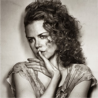
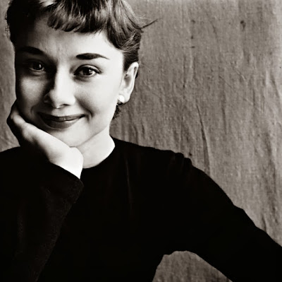 After looking at different portrait photographers, I realised that I have been exploring a lot of black and white portraits and therefore I feel it necessary to look at the work of American photographer Irving Penn and his signature style high contrast black and white portraiture.
To the left is an image of Al Pacino taken by Penn. The image was most likely taken in Penn's studio where he has used one source of light from a side angle, Penn was known for using natural light when using his studio but I am unsure if this is natural light or just a simple minimal lighting. The source of light that Penn has decided to place at the side of the subject means that half Al Pacino's face is shadows and the other half is highlights. The high contrast in the image makes the blacks really dominate the image and I believe this is why Penn choose a soft mid tone background. The high contrast also means that the photographs loses some detail therefore the lighting at the side brings that detail back in meaning that his face is really detailed and his hair is at one side then it loses some texture towards the dark side of his face.
I really like the use of high contrast and greyscale colour scheme as with the background it makes it feel like everything is stripped from the subject as there are no colours and his clothes are minimal, I think this makes the image seem more real and the expressions seem less posed.
The image over all has a really dramatic feel to it, this is because of the high contrast making the blacks really black and dominate the image making the image more bold and serious and therefore dramatic.
To the right is a photograph of Audrey Hepburn taken by Irving Penn for 'Vogue Magazine'. Unlike other portraits taken by Penn, the subject is smiling yet the image still feels pure because of the minimal colours and soft background therefore the smile looks natural and the photograph looks like it is showing us the subjects personality.
I really like the work of Irving Penn and hope to apply some of these ideas to my own Portraiture. I am most inspired by the minimal features and lighting in his images which make the photographs look more natural and as if everything is stripped to just purely show the subject as the subject.


 After looking at different portrait photographers, I realised that I have been exploring a lot of black and white portraits and therefore I feel it necessary to look at the work of American photographer Irving Penn and his signature style high contrast black and white portraiture.
To the left is an image of Al Pacino taken by Penn. The image was most likely taken in Penn's studio where he has used one source of light from a side angle, Penn was known for using natural light when using his studio but I am unsure if this is natural light or just a simple minimal lighting. The source of light that Penn has decided to place at the side of the subject means that half Al Pacino's face is shadows and the other half is highlights. The high contrast in the image makes the blacks really dominate the image and I believe this is why Penn choose a soft mid tone background. The high contrast also means that the photographs loses some detail therefore the lighting at the side brings that detail back in meaning that his face is really detailed and his hair is at one side then it loses some texture towards the dark side of his face.
I really like the use of high contrast and greyscale colour scheme as with the background it makes it feel like everything is stripped from the subject as there are no colours and his clothes are minimal, I think this makes the image seem more real and the expressions seem less posed.
The image over all has a really dramatic feel to it, this is because of the high contrast making the blacks really black and dominate the image making the image more bold and serious and therefore dramatic.
To the right is a photograph of Audrey Hepburn taken by Irving Penn for 'Vogue Magazine'. Unlike other portraits taken by Penn, the subject is smiling yet the image still feels pure because of the minimal colours and soft background therefore the smile looks natural and the photograph looks like it is showing us the subjects personality.
I really like the work of Irving Penn and hope to apply some of these ideas to my own Portraiture. I am most inspired by the minimal features and lighting in his images which make the photographs look more natural and as if everything is stripped to just purely show the subject as the subject.
Tuesday, 10 December 2013
 RICHARD AVEDON PHOTOGRAPHY
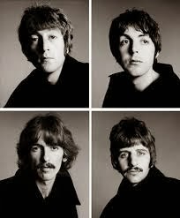
 Richard Avedon is an American photographer known for his influence on not only fashion and portrait photography but fashion and style on a whole in NYCI have chosen to explore Richard Avedon as he is such an influential portrait photographer who inspired our photographers of today, therefore by looking at Avedon I can see how newer photographer such as the likes of Rankin have been influenced themselves. To the left is an image of four photographs of 'The Beatles' placed in a form of grid, this is sourced from an Avedon archive online and when first looking the grid reminded me of a style of pop art.
The images are very simplistic as every member of 'The Beatles' are wearing black and all have a similar hair colour making all four photographs go together well.
The photograph is quite serious due to their facial expressions and I feel that the black clothing contributes to the serious feel.


MORE RICHARD AVEDON PHOTOGRAPHS
DAVID BAILEY PHOTOGRAPHY
 David Bailey is a well known English photographer who has inspired a lot of my portraiture work in the past, therefore I feel exploring his work will benefit me for this project.
To the left is a photograph of Jude Law by Bailey, it has a greyscale colour scheme meaning that it is black and white, it is quite minimalistic as there are not many features but this allows our attention to be drawn to all the detail.
The detail that I am most drawn to in the image is the face as the simple natural details such as his skin tones and lips and stubble add a great deal to the subject.
I find the composition of this photo interesting how Bailey has decided to crop the head out of the image, I feel this was to accentuate the models eyes, as he is tilting his head down yet raising his eyebrows and his eyes therefore the image focuses on the eyes making him look powerful and the crop of the image just contributes to this feel.
This image was taken in a studio as you can see by the highlights and shadows on the face for example the left side of his face is lit up as a highlight and the right side is a shadow yet you can see reflections in his left eye (which is in the highlights) therefore I think that studio lighting has been used.
The photograph on a whole for me has quite a pristine feel about it, I think this is due to the white background, the white and white clothing and colour scheme and the simplistic features of the image.

To the left is a photograph of Jude Law by Bailey, it has a greyscale colour scheme meaning that it is black and white, it is quite minimalistic as there are not many features but this allows our attention to be drawn to all the detail.
I find the composition of this photo interesting how Bailey has decided to crop the head out of the image, I feel this was to accentuate the models eyes, as he is tilting his head down yet raising his eyebrows and his eyes therefore the image focuses on the eyes making him look powerful and the crop of the image just contributes to this feel.
This image was taken in a studio as you can see by the highlights and shadows on the face for example the left side of his face is lit up as a highlight and the right side is a shadow yet you can see reflections in his left eye (which is in the highlights) therefore I think that studio lighting has been used.
The photograph on a whole for me has quite a pristine feel about it, I think this is due to the white background, the white and white clothing and colour scheme and the simplistic features of the image.
Subscribe to:
Posts (Atom)